Why you need a mood board for your brand and how to design one
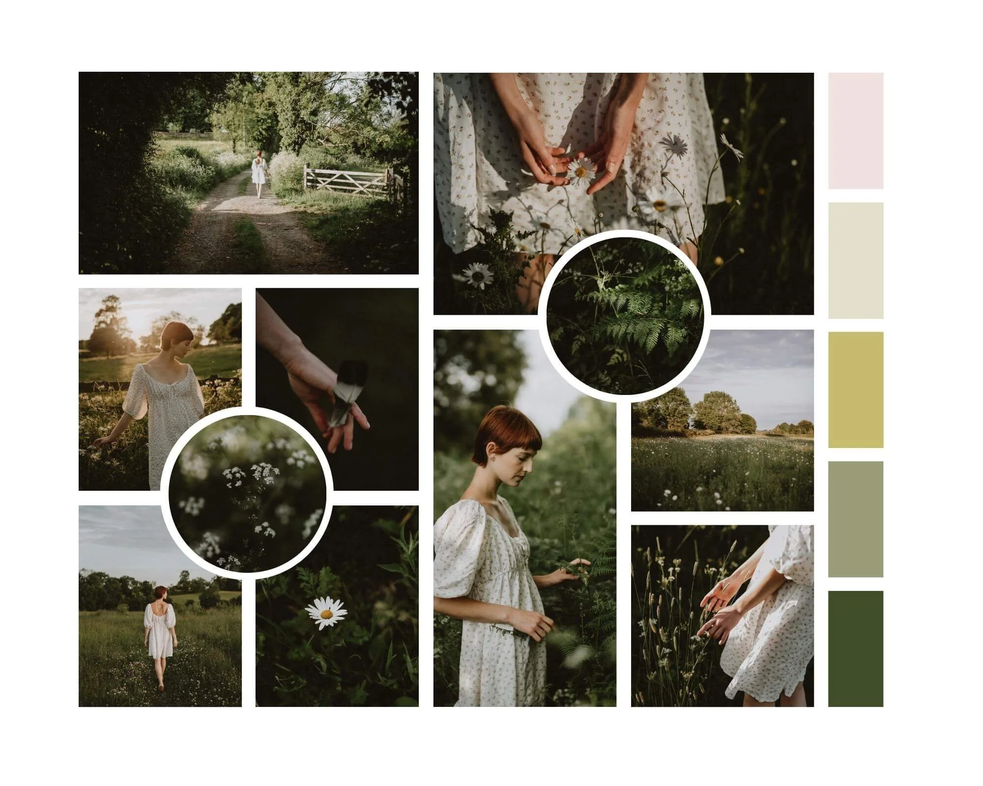
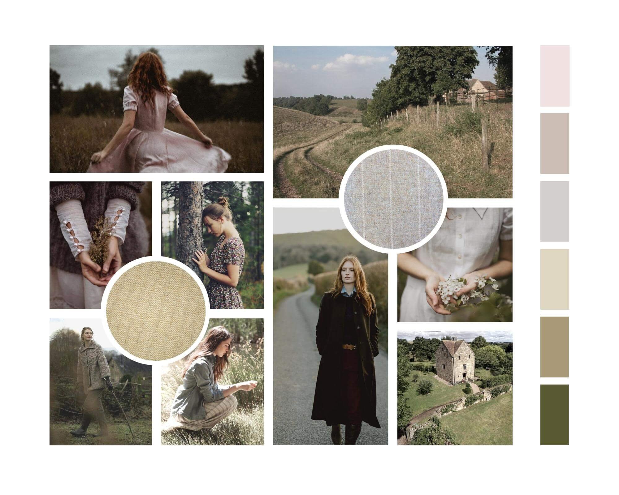
Mood board created from a photoshoot by Kate Cullen
Why are mood boards so important?
A mood board is there to define your brand’s story, aesthetics and purpose. It’s one of the most powerful visual aids you can devise for your business and helps you position it within your market as well as clearly identifying your niche.
A well-thought out design allows you to convey mood and ethos and ensure that your messaging is coherent. It saves time having to explain in many words what your brand stands for and can be incredibly powerful and emotive if done right. It will also be a great tool for you beyond the initial brand identity creation – allowing you to refer back to it as a frame of reference for future projects or work that you might consider taking on.
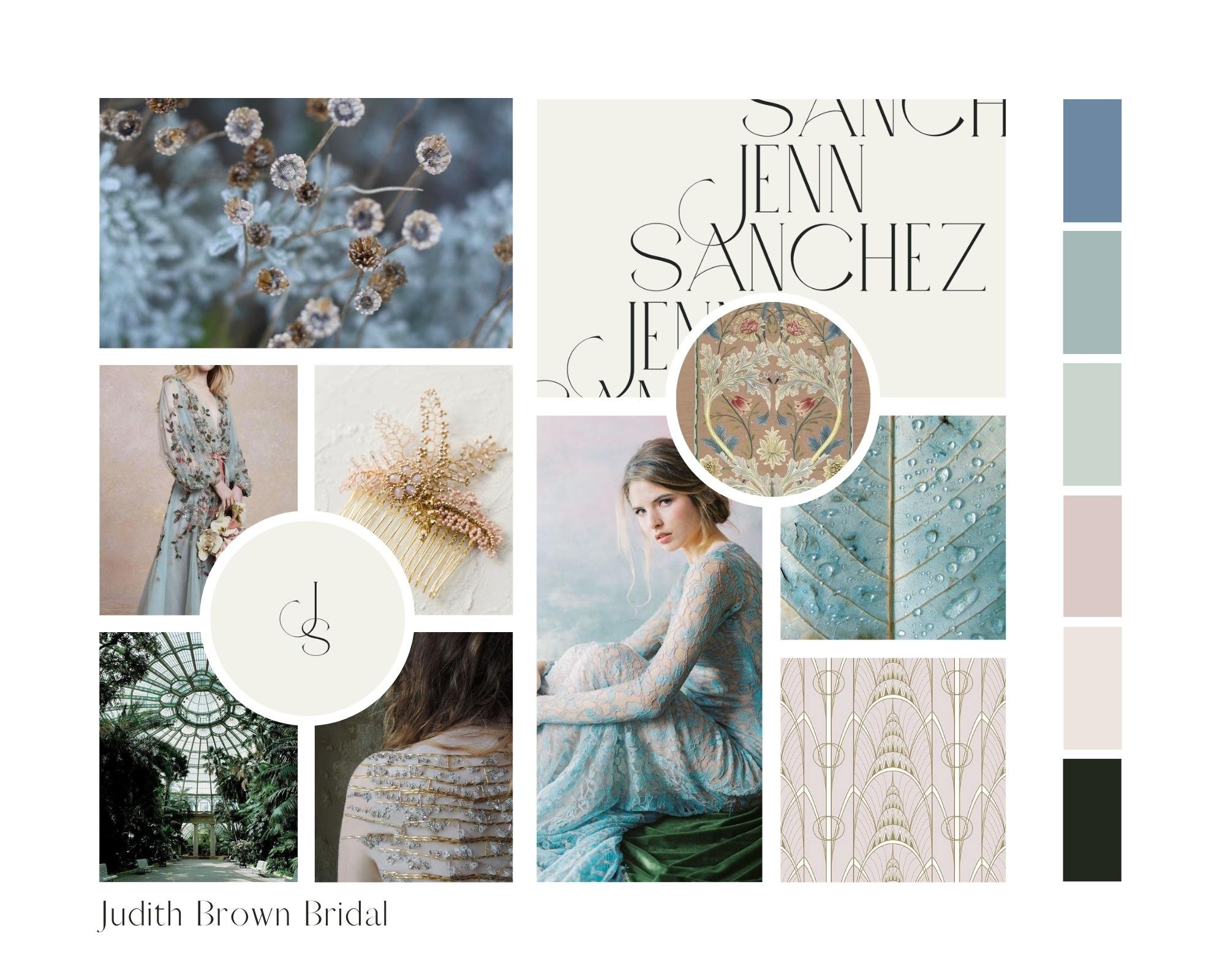
Mood board by Kate Cullen for Judith Brown (Images from Pinterest)
Stories are what matter
First and foremost when creating mood board for a brand I consider the STORY.
What are your trying to say?
I always begin my styled shoots or brand work with a story in my head, and from that a strong title and synopsis that is woven throughout all the elements I then fit together.
By retaining that story in my mind right from the start, the shoot always has meaning, a purpose, and an ability to make a connection with my potential clients. Often I hope also on a deeper level with people that will never be my clients.
Because, my artistic soul craves that.
Positive reactions from the people you admire and respect, is a hugely fulfilling part of what we do. After all we are not creating beauty just for ourselves, art is there to be enjoyed by a greater audience.
So, how to create these stories? I often hear from my clients that they simply don't know how to create the story. We are so conditioned in our 'Instagram filtered' lives into believing the aesthetics must come first. But this rarely (in my experience) leads to the sort of success we dream of.
Pretty is not enough.
Mood board by Kate Cullen for Dusk to Dawn Flowers (Images from Pinterest)
where do we find our stories?
From you.
Your stories must come from you. This is what will make them unique, relatable and form connections with your potential clients.
My own styled shoots and brand identity have included a great many stories that have began life as a small part of my own experiences, a memory of my Grandmother's garden as a child, a family heirloom, a book I read, a painting I adored, a poem that spoke to me.
The kernel of a brand or shoot idea can stem from the tiniest of moments or objects - a conversation with a lover, friend or family member; something used every day, or found in a long lost box; a building, a holiday or a building.
Look for the small things. Then layer real or imagined details on top.
If you have a beautiful ring for example, might you imagine where it was bought, when and by who. Who was its intended recipient, did they ever receive it? Was it lost, or found? Who made it? Question every element and begin to build your story.
Once you have breathed life into these characters and objects, then you can start to introduce the aesthetics, bearing in mind colour, mood, texture and ambience.
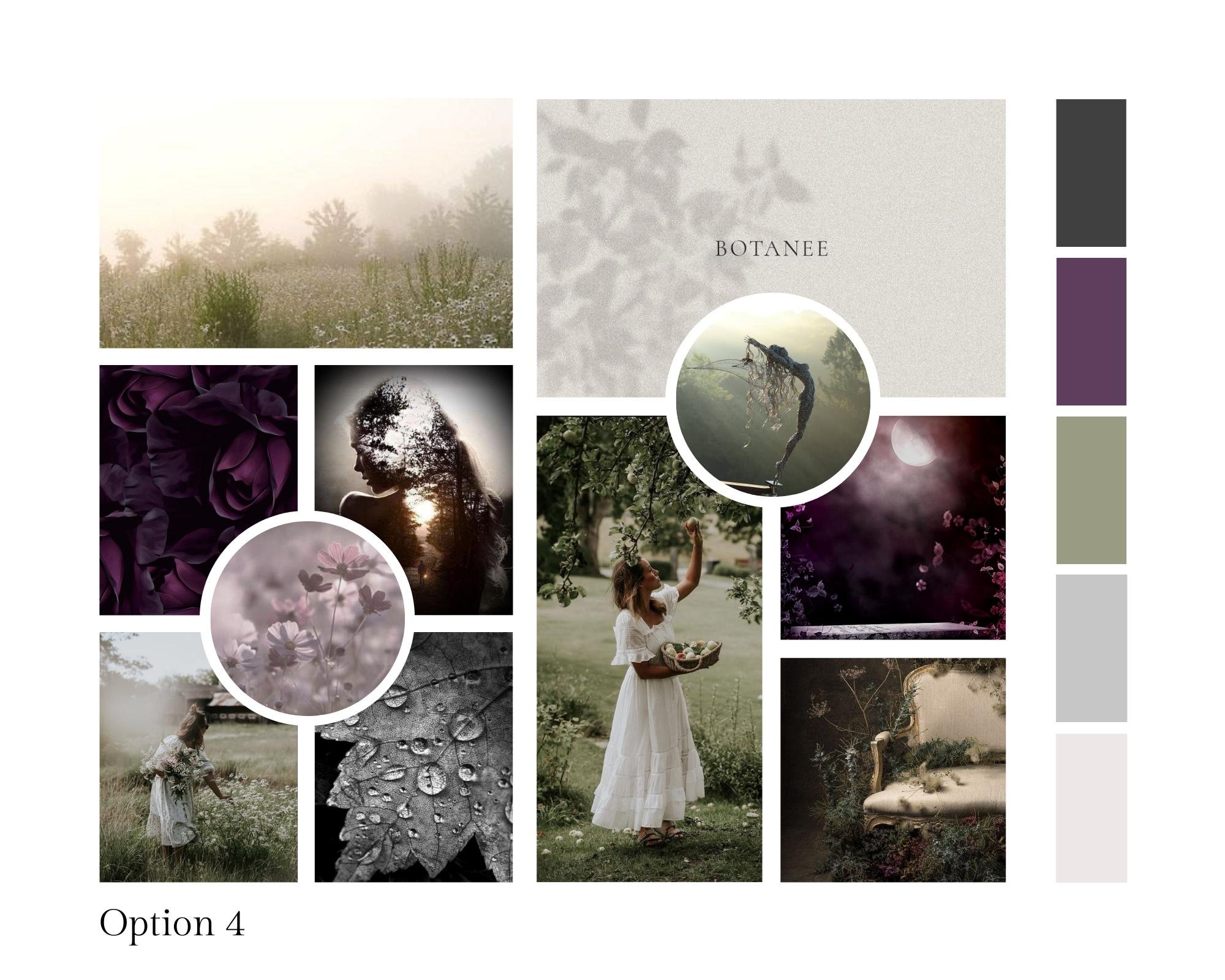
Mood board designed by Kate Cullen (Images from Pinterest)
Find your own path
Avoid going down the route of comparison when creating your brand identity, styled shoot or brand imagery in general.
When you first build your story idea do so away from your screen.
No Pinterest, no Instagram, no trawling blogs that are directly related to your industry.
You don't want to recreate what others have done, you want to burst with new ideas and creative freedom.
The more you look at what everyone else has been doing (especially those you admire or look up to in your industry), the more whatever you design will become sort of pale imitation, or worse, a copy of someone else's work.
Instead read books and poetry, listen to new music, go to an art gallery, take a long walk somewhere new.
Visit an historic house, go shopping, or wander previously unknown areas of your town or village.
Breathe in new experiences, find new sources of inspiration. Travel new routes.
Journal if you find that useful - write down your random thoughts, one day they might just be the seed of an idea.
What should be included in a mood board?
It is a powerful way to combine colour, texture, fonts and images in a way that tells the story of your brand.
Colour and texture has always been at the forefront of what I do. They go hand in hand and I always consider them together, not as entirely separate elements.
For example, you can use one colour and many textures to create layers of meaning. Or you can go the opposite way and use many different colours and only one or two textures.
The fun is in the paring up of these elements to create another dimension to your story.
The softness of flower petals, the roughness of stone, the silkiness of a dress, the rich tones in jewellery, the patterns on venue walls and floors. Consider each and every component of your products or services and how they can be shown in overall themes and ideas.
It can be helpful to choose your colour palette and name the shades you choose. Making sure they reflect your brand or hoot concept and design.
Any way you can reinforce your story, however subtly, will give you better results. Your audience might never know all these details even exist, but they will find themselves engaging more with your content because of it.
Love every detail. Don't settle for any element that doesn't work for you on all levels.
Mood board by Kate Cullen for Polly Reid Collection Photoshoot (Images from Pinterest)
How to create a mood board
I often begin with a physical mood board - pulling together the elements I've talked about including textures and colours, stillness and movement. This can be done without making anything permanent - just gather props, fabric swatches, magazine cuttings, paint cards, dried flowers - anything that simply 'works' with your concept.
Curate this carefully, discarding things that then don't fit with the whole. Only then do I proceed to the digital process. I start a secret Pinterest board - pinning as much abstract content as possible - the more you can avoid pinning other similar businesses’ work, the more unique your mood board will be.
Be sure to pin plenty of the type of textures and photography you will include in your designs. There's no use pinning endless moody interior shots if your style is light and airy, or vice versa.
Once you have defined imagery that completely harmonises with your concept, then you can start to create your mood board.
I use Canva collages, adding in fonts and colours. A handful of words, lines and graphic too if relevant to the project I’m designing (be it for a brand identity, or for my photoshoots). You can use many images or just a very few. My recommendation is though that you truly adore them – no half measures – passion is key.
Once you have your mood board I strongly suggest you sit with it for a while – stick it on your desk or the fridge – if you still love it in a couple of weeks’ time then the chances are you have created a purposeful, long-lasting look that is truly you.
If you want help being guided through the entire process of creating a brand identity then do book a free discovery call to talk through your options.
